Advanced Options Analysis and Trading Tools - OIGenie
Oi Chart
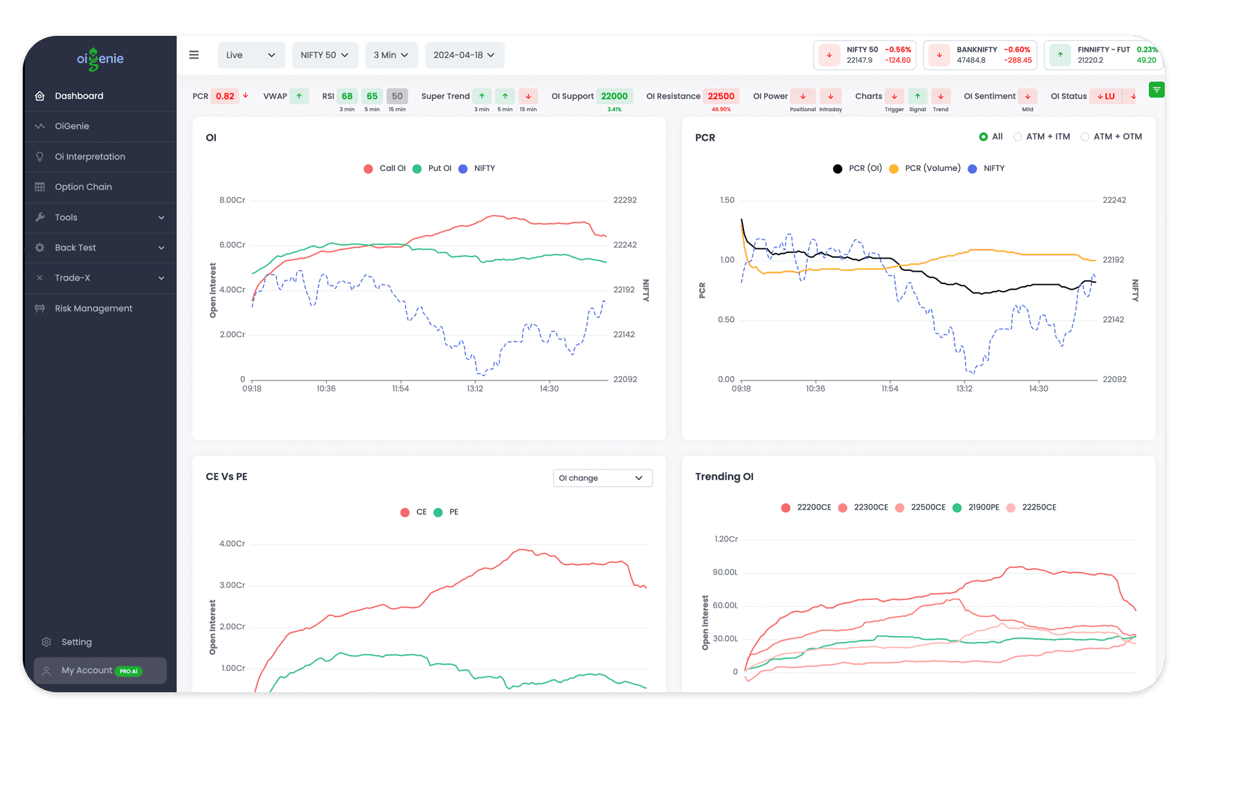
View the Call Oi and Put Oi alongside the asset's price in a chart format for a clear visual representation of market trends. This comparison can help identify whether bullish or bearish sentiment predominates and forecast potential market movements.
A sudden decrease in Call Oi combined with an rise in Put Oi signals a market reversal towards bullishness. Conversely, a sudden increase in Call Oi and a decrease in Put Oi indicate a market reversal towards bearishness.
View the Call Oi and Put Oi  with Oi Chart
PCR Chart
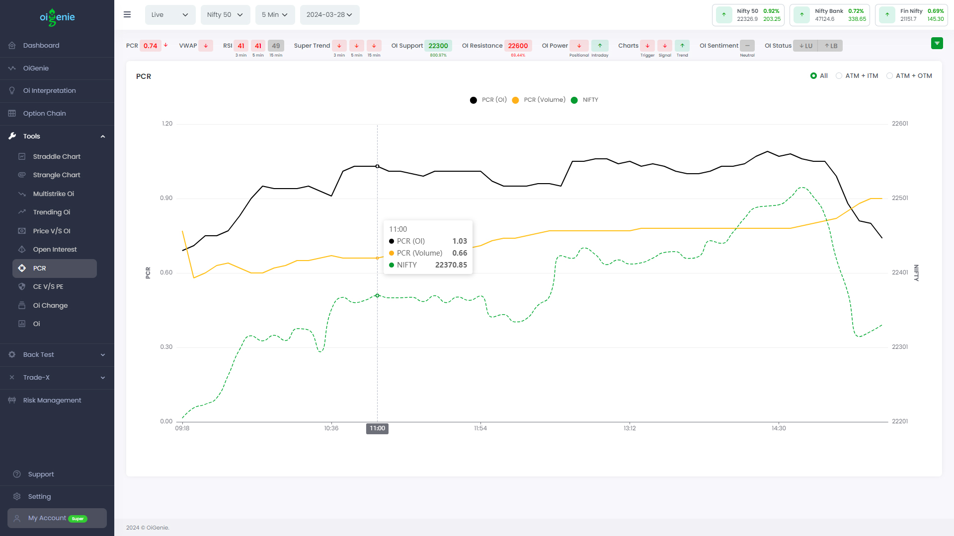
See the PCR values (Oi and Volume) for both ATM+ITM and ATM+OTM as a line chart to see the market momentum.
Rising PCR: A rising PCR suggests bullishness in the market.
Declining PCR: A declining PCR suggests bullishness in the market.
See the PCR values with Oi Chart
Oi Change Chart
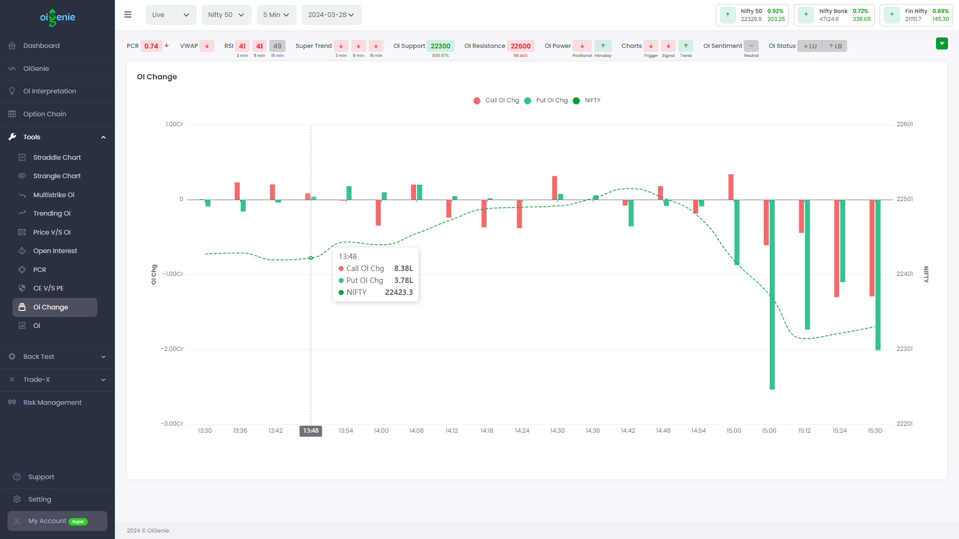
The OI Change chart presents the change in open interest (OI) for call and put options along with the underlying asset's price movement throughout a full trading day. Each bar on the chart represents the OI change over a specific time period, with positive bars indicating an increase in OI and negative bars indicating a decrease.
By visualizing this OI change chart, traders can gauge the overall market sentiment and potential future price movements. When call option OI rises sharply, accompanied by a decrease in put option OI, it generally signals bullish sentiment and a potential price rise. Conversely, when put option OI increases significantly, coupled with a decline in call option OI, it may indicate bearish sentiment and a potential price drop.
The chart allows traders to identify potential market reversals by monitoring the shifts in open interest between call and put options relative to the underlying asset's price movements. Sudden spikes or dips in one option type's OI, coupled with an opposite movement in the other, can signal an impending trend reversal.
Oi Change Chart
Open Interest
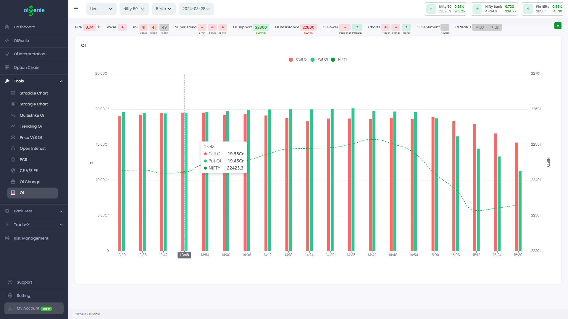
The chart shows the Oi over specific time intervals.
This chart displays the Open Interest (OI) of call and put options along with the price movement of the underlying asset throughout the trading day.
By analyzing the relationship between the OI levels for calls and puts, along with the asset's price fluctuations, traders can gain insights into market sentiment and potential future price movements.
Traders can use this chart to identify potential trend reversals by monitoring divergences between the OI lines and the price line. For instance, if the call option OI line starts declining while the put option OI line rises, coupled with a downward price movement, it could signal an impending bearish reversal. Similarly, an increasing call option OI line and a decreasing put option OI line, accompanied by an upward price trend, may indicate an imminent bullish reversal.
Overall, this OI and price chart provides a comprehensive view of market dynamics, enabling traders to assess the prevailing sentiment based on option activity and anticipate potential price reversals or continuations of the current trend.
Open Interest
CE vs PE Chart
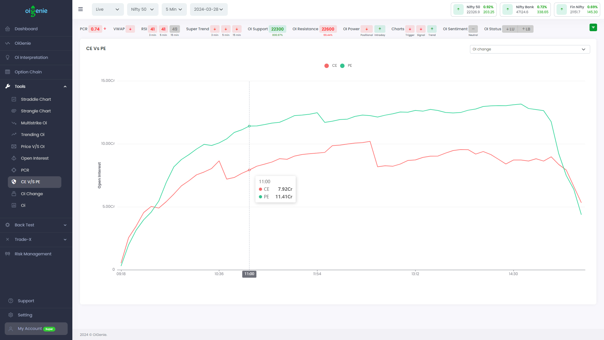
CE vs PE chart compares the cumulative distribution of Call (CE) and Put (PE) options contracts at different strike prices within a given expiry period. It visually depicts the open interest of Call options (CE) versus Put options (PE).
You can visually see the domination of the participants whether they are bullish or bearish. Crossover or sudden rise or fall can be determined as reversals.
CE vs PE Chart
Trending Oi
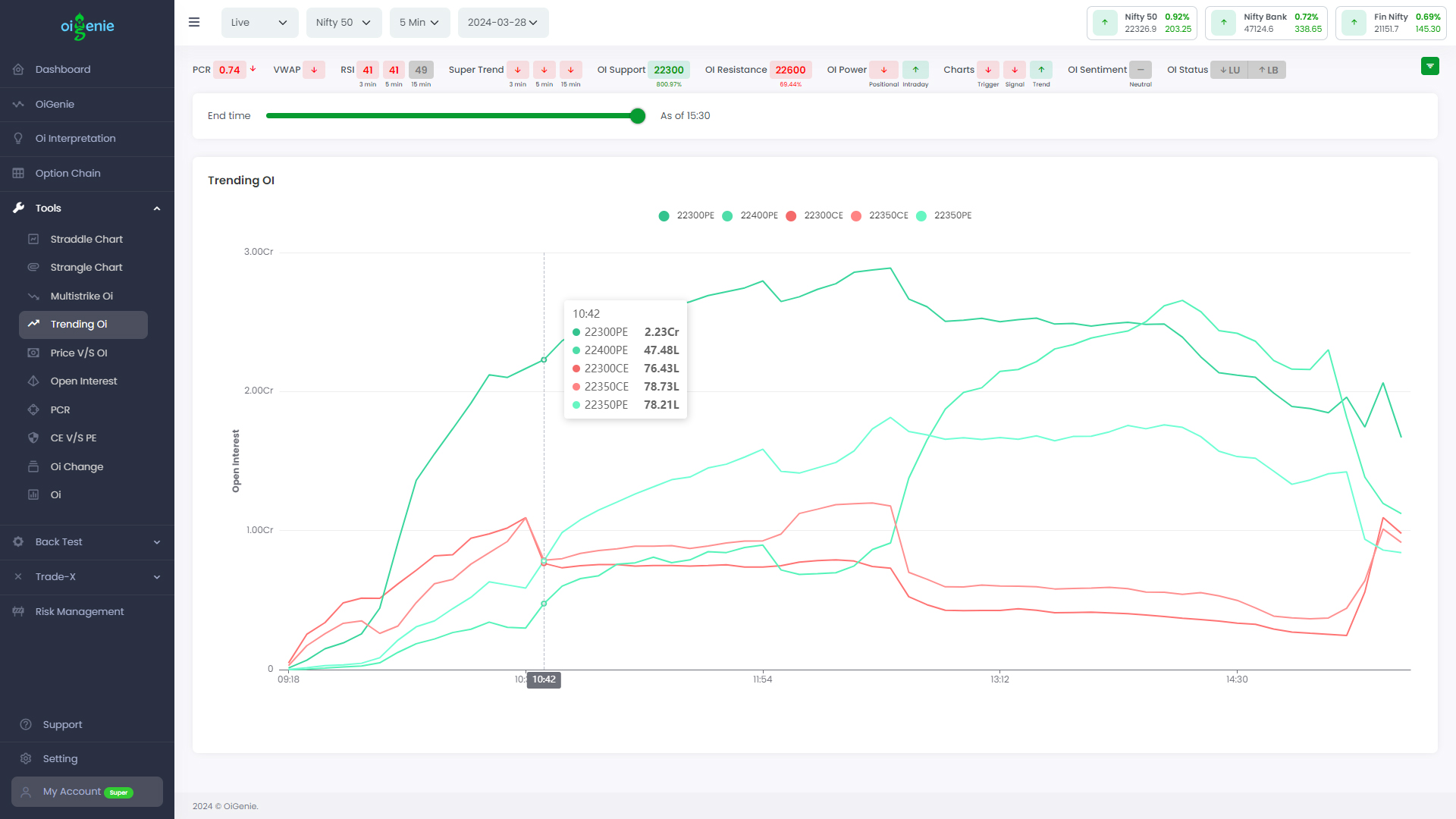
Trending Oi chart displays the top five strikes with the highest open interest change across both Call (CE) and Put (PE) options throughout the trading day.
By analyzing the OI curves, one can gauge the sentiment and positioning of market participants (bullish or bearish) across different strike prices. Significant shifts or crossovers in the OI lines can potentially signal potential reversals or changes in market direction.
Additionally, the range slider allows you to navigate through different time periods, enabling a detailed examination of the OI dynamics at any given point during the trading session.
Trending Oi chart
Oi Interpretation
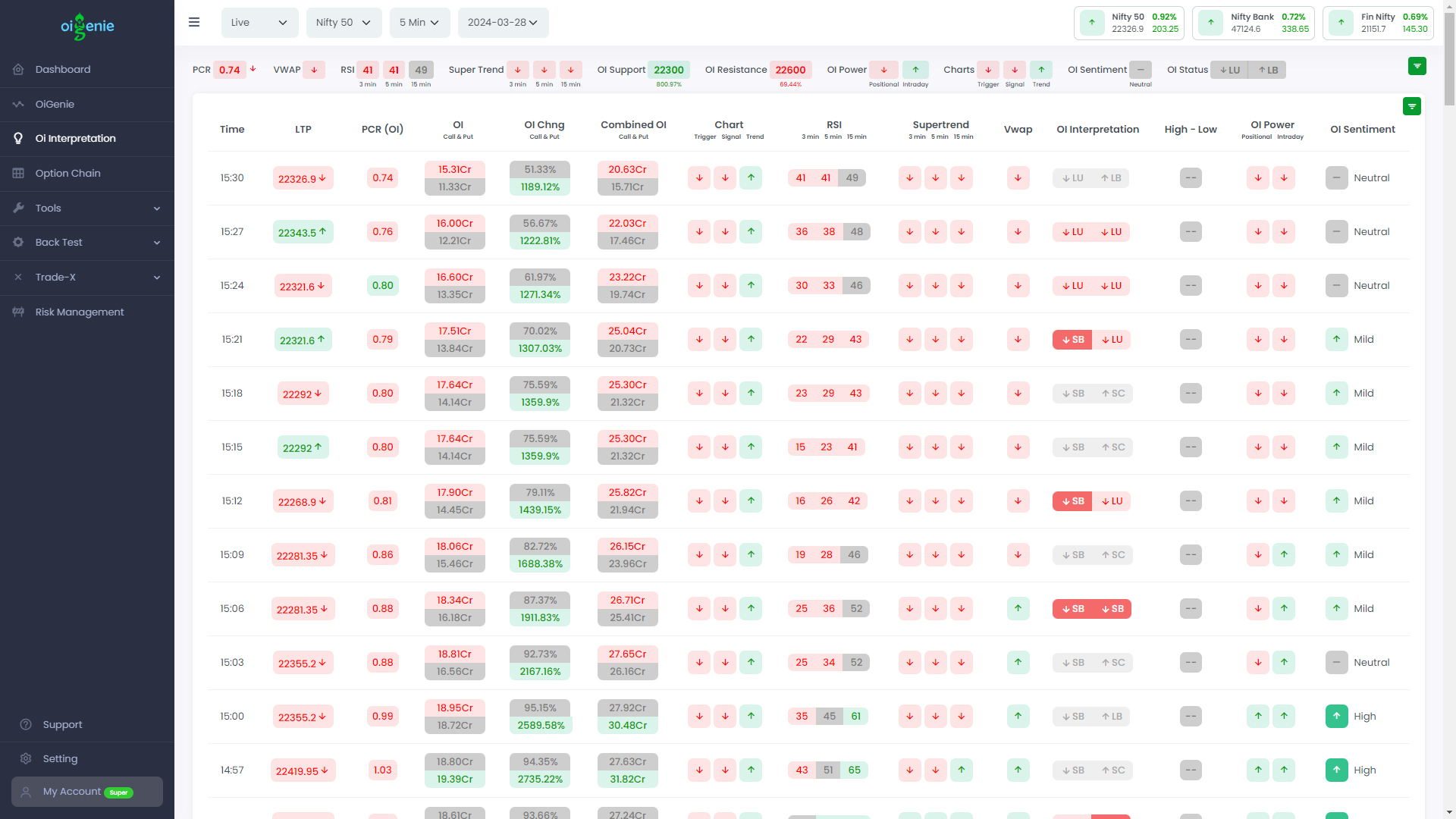
See timestamp wise LTP, PCR(Oi), Oi (Put and Call), Oi Change (Call and Put), Combined Oi (Call and Put), EMAs (Signal, trigger, trend), RSI (3 min, 5 min, 15 min), Supertrend (3 min, 5 min, 15 min), VWAP, Oi Interpretation, Day high or low break, Oi power, Oi Sentiment.
Oi Interpretation
Easy option chain
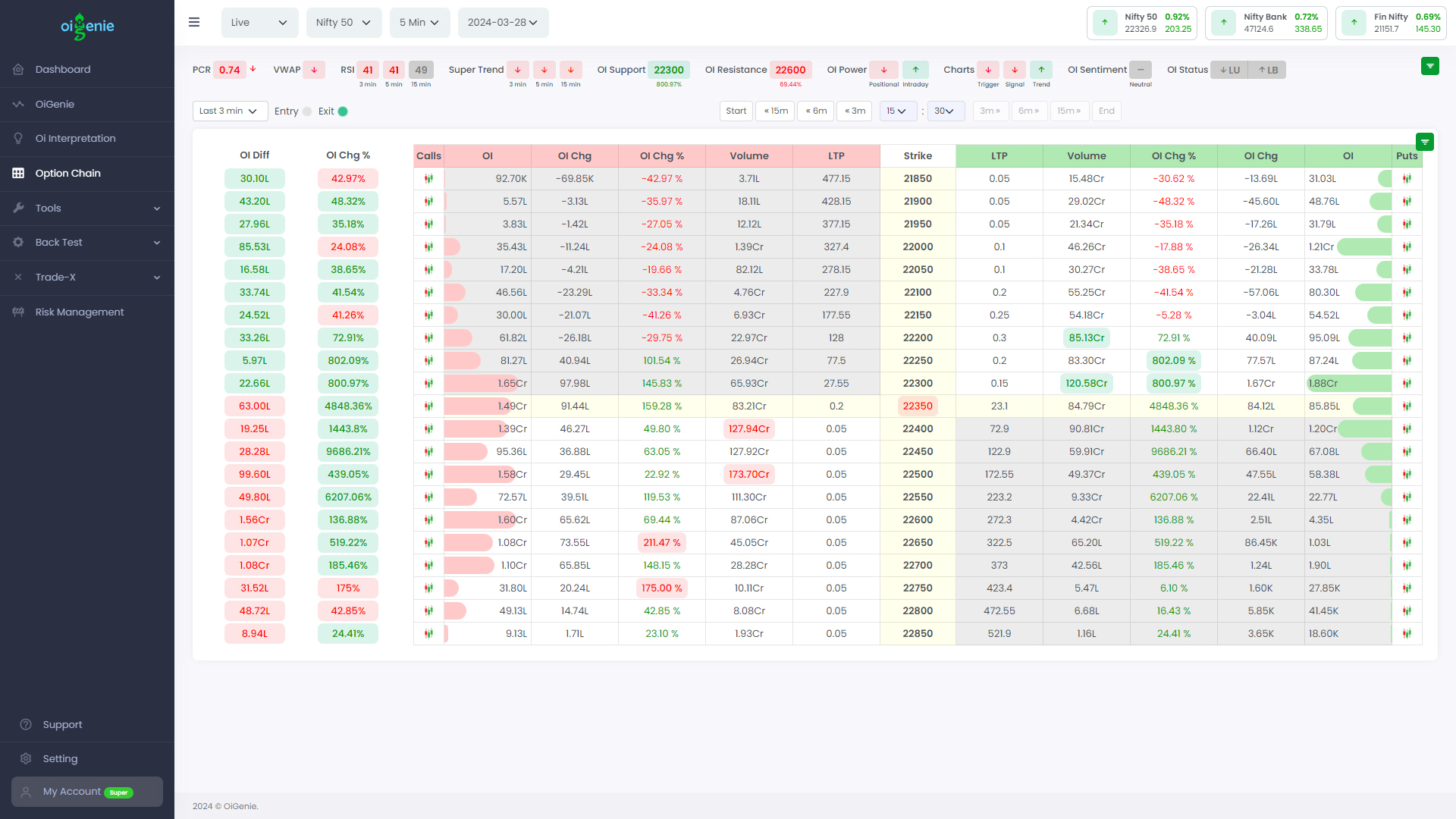
Easy option chain with support and resistance highlights. The option chain is also available in historical time intervals (3min, 5min and 15 min). Compare the participant data by going through the historical timestamps.
Easy option chain with support and resistance highlights
Straddle chart
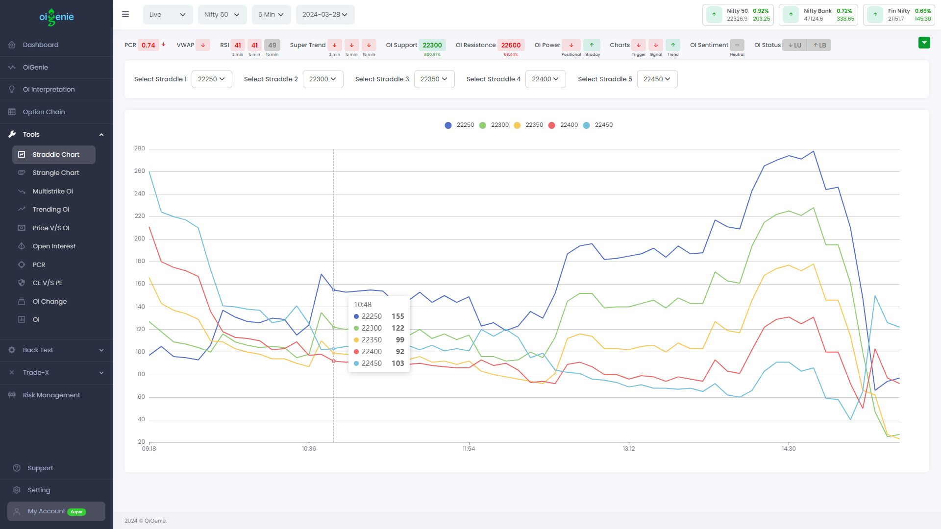
The chart displays the straddle levels for different strike prices, where each data point represents the sum of the prices of call and put options. This visualization helps traders analyze the price dynamics and volatility expectations across various strike levels.
By monitoring the straddle values over time, one can gauge the overall market sentiment and potential shift in trend. Significant changes in the straddle curves, such as sharp rises or falls, can indicate potential reversals or shifts in the underlying market's direction.
Additionally, the ability to select and compare multiple strike levels simultaneously allows traders to identify strike-specific price action and make informed trading decisions based on their strategies and risk profiles.
Straddle chart displays the straddle levels
Strangle Chart
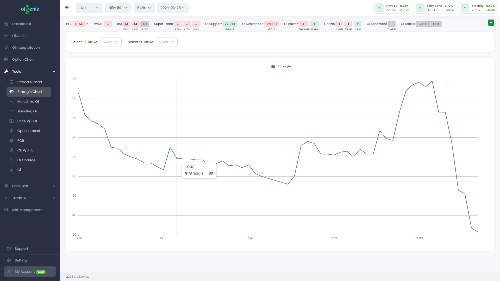
The strangle chart displays the sum of the prices for call and put options at different strike prices over a period of time. it allows you to analyze the distribution of options trading activity across various strike prices.
The dropdowns at the top allow you to select the specific call strike (CE Strike) and put strike (PE Strike) prices you want to analyze.
By examining this strangle chart, you can gain insights into the overall sentiment and positioning of options traders. For example, if the line is skewed towards higher strike prices, it may indicate bullish sentiment, while a skew towards lower strikes could suggest bearish sentiment.
Additionally, you can observe patterns such as sudden spikes, or troughs, which may signal potential reversals or shifts in market dynamics.
Strangle Chart to
Multistrike Oi
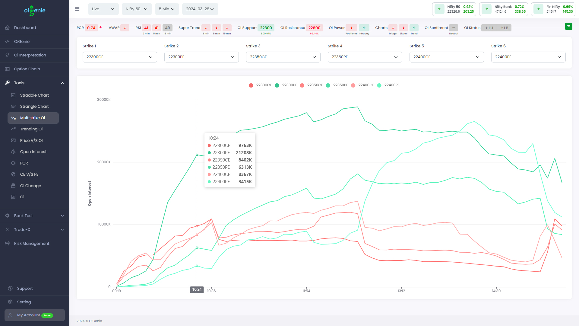
This chart displays the open interest (OI) changes over time for multiple strike prices of both call (CE) and put (PE) options. It is a multi-strike open interest chart that allows you to analyze the options trading activity across various strike prices simultaneously.
At the top, you have dropdowns to select the specific strike prices you want to track for both call and put options. Each selected strike price is represented by a different colored line on the chart.
By examining this chart, you can gain insights into the overall sentiment and positioning of options traders at different strike levels. For example, if the open interest is increasing for higher call strikes, it may indicate bullish sentiment, while rising open interest for lower put strikes could suggest bearish sentiment.
Additionally, This multi-strike open interest chart provides a comprehensive view of options trading activity across various strike prices, allowing you to identify potential trading opportunities or market movements based on the distribution of open interest.
Multistrike Oi
Price vs Oi
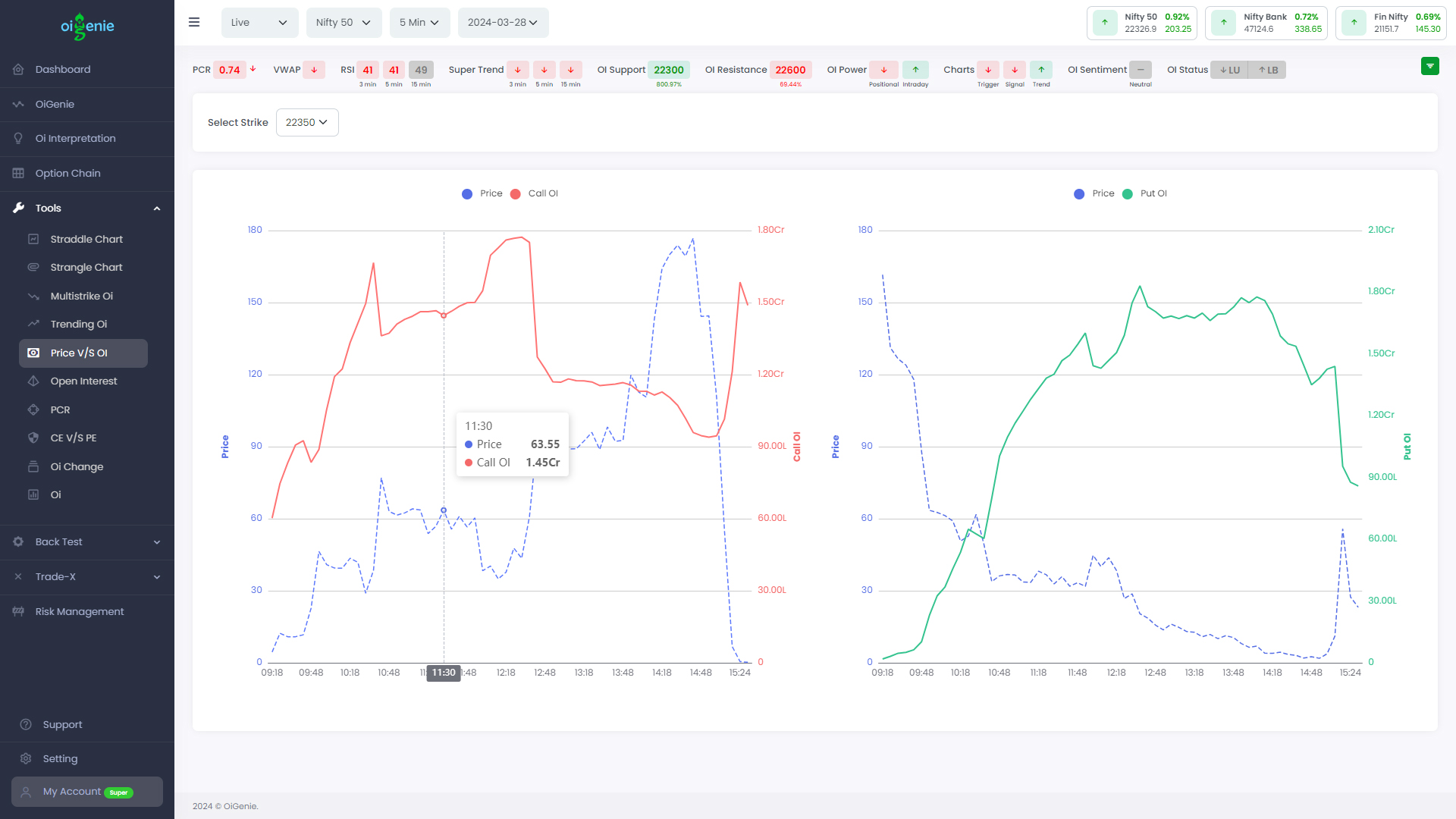
The call and put charts depict the relationship between price and open interest (OI) for options contracts over time. Each chart presents a line for price and a line for OI, showing how they fluctuate at specific points. By analyzing the data, you can identify trends, such as when changes in price or OI signal potential market shifts. This helps you discern the strength of bullish or bearish sentiment and anticipate possible reversals.
Price vs Oi
NSE Approved